In early 2017, I decided to convert one of my client’s applications from Blaze to React. This is the story of that conversion effort. If you are a Meteor developer, this post will likely be interesting to you, particularly if you are considering moving to React. For ordinary folks, I’ve done my best to minimize technobabble.
As a byproduct of the conversion process, I created a reusable framework called VXFrame. I’m looking for opportunities to use VXFrame to develop new React systems or to expedite the migration of existing systems from Blaze to React.
Motivation
If you have been following Meteor blogs, you are likely aware that React has factionalized the community. Rumblings about React began in 2015 as Sacha Greif, the author of Discover Meteor, published a series of articles that explain how to migrate a Meteor application from Blaze to React. Then, in November 2016, Meteor guru Arunoda Susiripala bid farewell to the Meteor community, moving on to work on Next.js, a minimalistic React framework.
These events piqued my interest, and I began to evaluate React in earnest. I decided to convert a production application named Incentive Sherpa from Blaze to React. I took this aggressive approach because I feel that no tutorial can give one the depth of experience that can be gained by committing to a real project and pushing it through to completion.
I had originally estimated that the project would require 60 days, but it ended up taking over 100 days. To put this in perspective, understand that Sherpa was a medium-sized, multi-tenant SaaS application based on Meteor 1.3. It incorporated a variety of third-party packages that are the hallmarks of a typical enterprise application. Sherpa used the so-called advanced Bootstrap implementation which facilitated control over appearance and layout via configuration variables.
Sherpa size metrics:
- 13 major subsystems
- 35 Blaze templates
- 26 routes
- 11 modals
- 51 Meteor methods
- 10 daemon processes
Although Sherpa was in good technical shape to serve as the baseline for the conversion effort, the system had a lot of redundancy, primarily due to evolution. Over time, new subsystems were tacked on by cloning existing subsystems and modifying them to meet requirements. Suffice it to say that the system could benefit from some refactoring.
My guiding philosophy for the conversion process:
- DRY
- Be systematic
- Don’t introduce new bugs
- Capture reusable logic, patterns and techniques
React Components in Blaze Layouts
You can embed React components into Blaze templates using package react-template-helper. My very first React component was created and tested using this approach. Theoretically, you could use react-template-helper to incrementally convert an entire application into components, starting with low-level Blaze templates and then building upwards to create higher and higher level components until all templates have been systematically replaced. This approach would make it possible to keep the system functional at all times, at the expense of some additional testing and the creation of some throw-away code.
Package react-template-helper is ideal for developers experimenting with React; however, I decided against using it because I was committed to a comprehensive conversion process that would ultimately eliminate Blaze.
Using BlazeLayout and ReactLayout Together
You can use BlazeLayout and ReactLayout together in the same application. Certain routes are rendered by Blaze while others are rendered by React.
I tried to use this approach but I encountered difficulties. Since Blaze and React render HTML into different root HTML elements, the system failed to clean up after route changes, causing defunct pages to linger in the DOM, screwing up the UI.
Although I was able to circumvent this problem by dynamically adding/removing CSS classes to control the visibility of pages generated, I considered this to be a hack, so I was hesitant about pushing a hybrid Blaze/React system into production and decided against it.
Wholesale Conversion
I began performing the conversion effort on an isolated GitHub branch. I was taking my time with no hard deadline, and had no requirement to keep the system working at all times. I decided to abandon the incremental approach and began converting entire subsystems all at once.
My First Subsystem: Events
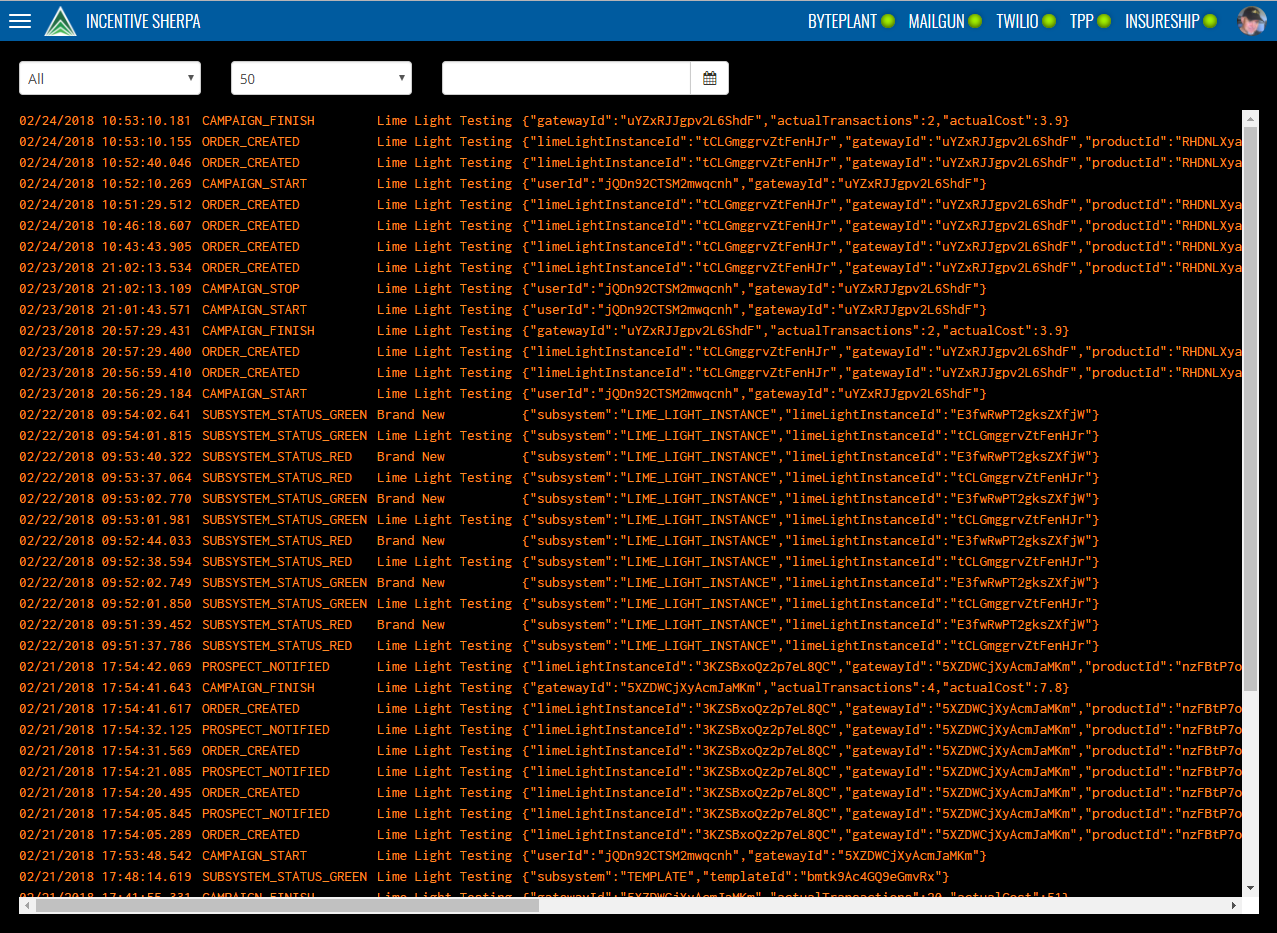
I began my conversion effort with a small subsystem called Events, an administrative page that displays a list of event records:

I printed a screen shot of the Events page and used a pen to circle elements in order to plan my component hierarchy. I initially came up with this component outline:
Top bar

Burger button

System logo

System name

Subsystem status indicator (many)

Profile photo

Event selection criteria row

Event type selector

Rows selector

Date selector

Event display body

Event display row (many)

Event display cell (many)
I quickly realized that the Events subsystem would require more effort than I had anticipated. There would be extra work to create universal shared layout components, such as the top bar, plus the off-canvas navigation panel fly-out that appears when the user touches the burger button. I decided to work on these shared layout components first.
The need to support layouts led me to Arunoda’s React Mounter (NPM react-mounter), which is ideal for converting a typical Blaze application that uses layout templates. React Mounter allows you to mount a hierarchy of components by specifying a layout component plus a content component. React Mounter does everything necessary to mount the layout component as a container with the content component serving as the body.
I added react-mounter to my tech stack and began experimenting with it. The package worked beautifully, and I wholeheartedly recommend it for any application that uses reusable layouts.
Components
From a developer’s perspective, a React-rendered browser page can be seen as a hierarchy of components. The entire browser page is typically represented by a top-level container component that includes many nested components; together, these components represent the page that the user sees.
A component is declared as a JavaScript class. Ideally, each component should be declared in its own JSX file to facilitate easy reuse.
Using JavaScript import statements, parent components can reference to child components, effectively declaring a hierarchy.
At run time, when the user chooses a route, FlowRouter will mount (i.e., instantiate) the top-level component of that route. After invoking several life-cycle methods, the React mounter will start a process that causes the components to build the HTML page.
Each component must have a render method, which is written by the developer. The render method must return either raw HTML, one or more child components, or a combination of the two.
When React renders a top-level component, it will indirectly render referenced subcomponents. React renders the hierarchy of components in a carefully choreographed dance, resulting in the HTML page that the user ultimately sees.
Components render HTML in accord with their properties which play the role of the model in the MVC design pattern. In a well-structured React application, the HTML rendered by a component is exclusively a function of the render method and the properties supplied to the component. Properties are the model, the component is the controller, and the rendered HTML is the view.
After the initial rendering, React keeps all component instances in memory. Those component instances play an ongoing role: any changes to properties will cause the component to dynamically re-render its respective HTML. This is how React facilitates reactive behavior which is familiar to Meteor developers.
React offers two ways to declare components: ES6 classes or functions. Moreover, rendering logic can be expressed as either JSX or straight JavaScript. I chose to use ES6 classes as JSX, which is currently the preferred way to use React.
Seasoned React developers segregate their components into two broad categories: higher-order components (HOCs) and components:
- HOCs are container components that handle data fetching and subscriptions
- Components render HTML in accord with properties
In a Meteor/React application, HOCs set up subscriptions and fetch data. A typical Meteor HOC will have only a single method withTracker that fetches data from various sources and uses it to build a properties object. The HOC supplies the properties object to a lower-level component (henceforth subcomponent).
It is best practice to have the HOC and its subcomponent share the same name, except the HOC name will have the suffix Container appended. Example:
- EventsTableContainer – HOC that fetches data and supplies properties to EventsTable
- EventsTable – subcomponent that receives properties from HOC EventsTableContainer
While an HOC is tightly coupled with one subcomponent, a given subcomponent may receive properties from many different HOCs. This ability to reuse a single component from different HOCs is an important technique for maximizing component reuse.
HOCs do the heavy lifting in a Meteor/React application. They can be somewhat difficult to code and test because they deal with database queries and because method withTracker is reactive. Updates to any database collections referenced within withTracker will cause withTracker to be automatically re-executed, causing the HOCs subcomponent to be re-rendered. This occurs because withTracker serves as both an imperative function and an event listener. This crazy behavior will be hauntingly familiar to seasoned Meteor developers, whom are nodding their heads in agreement as they read this. React improves on Blaze by encapsulating this tricky logic inside HOCs. This encapsulation makes it easier to pinpoint problems, ultimately reducing cost.
A well-written subcomponent will never directly invoke a MongoDB fetch operation, but will instead render HTML in accord with supplied properties. Subcomponent rendering logic should refer only to neutral component properties, which can be seen as the source of truth governing all rendering decisions.
Dividing responsibilities between HOCs and normal components is an excellent way to separate concerns. Many React developers enthusiastically support this approach, because it clearly separates the concern of data fetching from the concern of rendering. This approach also makes normal components easier to reuse. As long as an HOC can be written to supply the expected properties, the normal component can function properly in any usage scenario.
Declaring HOCs
A Meteor/React application will consist of a mixture of HOCs and normal components. There are two approaches to using HOCs:
- Declare a single top-level HOC that fetches data, then passes that data as properties down through the hierarchy of subcomponents.
- Declare many narrowly-focused HOCs at various levels in the component hierarchy.
While there is no right or wrong answer, I personally tend to use many narrowly-focused HOCs. This minimizes property handling by keeping HOCs close to subcomponents that they feed.
Granularity
You will need to decide on the proper granularity of your components. While there are no hard-and-fast rules, I’ve discovered a technique that you may find helpful.
If you notice repeating patterns of HTML in your render method, you can eliminate redundancy by breaking out the repeating HTML into a reusable component. If you DRY, you will create more components than you had expected. I had guessed that Sherpa would require a few dozen components, but by the time the conversion effort was completed, I had authored 64 HOCs and 168 normal components, a total of 232 components.
By the way, early in the project, I struggled with a kind of psychological aversion to creating new components. I was primarily concerned about performance. Yet, after some experimentation, I found my performance concerns were unfounded. I was seeing excellent performance, better than Blaze in most instances, even in subsystems with hundreds of components.
Once my concerns had been put to rest, I proceeded to create components with wild abandon. Now, I can create new components effortlessly, and surprisingly, those components will often work correctly the first time without debugging.
Naming Conventions
When you create a large number of components, standards and naming conventions become super important. Here are some standards that I choose to abide by:
- One HOC or normal component per file
- Component name makes sense and is self-documenting
- Components are stored in different folders broken down by subsystem
- Component name matches file name
- HOCs always end with Container
In many cases, there will be a one-to-one correspondence between an HOC and its contained component. However, it will occasionally be advantageous to define multiple HOCs that wrap the same component. Consider this example:
| HOC |
Wrapped Component |
| OffCanvasNavStandardContainer |
OffCanvasNav |
| OffCanvasNavDiagContainer |
OffCanvasNav |
Both OffCanvasNavStandardContainer and OffCanvasNavDiagContainer serve as wrappers for OffCanvasNav. Each HOC may have completely different subscriptions and different rules for fetching data. This is absolutely fine, as long as both HOCs supply properties as necessary to meet the requirements of subcomponent OffCanvasNav.
Blaze Data Contexts Versus React Properties
Behind every Blaze template there exists a tree of objects called the data context. Under Blaze, the data context plays the role of model in the MVC design pattern.
Blaze provides the developer with several options for setting the data context of a Blaze template, but by far the most common approach is to allow Iron Router to provide it. For each route path, Iron Router fetches and returns a tree of objects which comprise the data context of that route. Instructions for retrieving data context objects must be expressed by the developer in the Iron Router data function, which is part of each route descriptor. Iron Router provides the data context to Blaze so that templates can refer to it during HTML rendering.
Meteor developers tend to complain about the way Iron Router deals with data contexts. Hard-core Meteor insiders characterize it as an anti-pattern, and they have devised clever ways to improve the situation. One solution is to remove Iron Router from the system, add FlowRouter, and then use template-level subscriptions. This approach is recommended by many Meteor gurus, and I agree with them wholeheartedly. But for clarity, I will compare the design of a typical, clunky Blaze application, in which Iron Router establishes data contexts, with a modern React application.
One problem with Blaze is that it treats the data context as the sole input into the template rendering process. There is no easy way to configure a template to appear or behave differently in different usage scenarios. For example, consider an ostensibly-reusable template that renders a user list into HTML. In some scenarios, the user list may need to be selectable, while in other scenarios, selection of the user list must be inhibited. In order for the user list template to be easily reusable, there should be a convenient way for the developer to configure the template to behave differently in different scenarios. Ideally such configuration settings would be supplied by the parent (i.e., calling) template.
Another problem with a typical Blaze application is that data contexts are monolithic; there is only a single tree of data for each route, and that tree must contain the union set of all data needed by all templates used within that route.
This monolithic data context makes it hard to write reusable templates. Clearly, templates must know the names of fields in the data context, but they must also be intimately aware of the structure of the data context in order to successfully navigate via Blaze functions such as Template.currentData and Template.parentData. These navigational functions are hard-coded into the supposedly-reusable template. Consequently, a reusable template becomes tightly coupled with a specific data context. Attempting to reuse that template elsewhere will require coding changes to replicate those portions of the data context required by the reusable template. The effort to keep data contexts in sync with ongoing enhancements to templates makes Blaze programming more tedious than need be.
React eliminates this problem by allowing each component to explicitly declare its information needs (i.e., properties), tantamount to a schema. At runtime, HOCs perform retrieval functions and then supply data as properties to lower-level components. If those properties fail to satisfy the declared requirements of lower-level component(s), the application will fail with a clear explanation logged to the developer console. Such problems can be fixed very quickly at low cost.
In contrast to a legacy Blaze application with monolithic data context, a React route can have many HOCs at different levels, tantamount to having many data contexts. This means React applications tend to have better encapsulation than Blaze applications. Better encapsulation makes it easier to develop reusable component that work predictably and reliably in different usage contexts, even if those components require complex configuration settings.
Of course, there is no free lunch, and React components take more time to develop than standard Blaze templates.
The bottom line is that Blaze allows developers to cut corners in a way that seems perfect for churning out proof-of-concept MVPs while React engenders industrial-strength discipline that screams this is enterprise software.
VXFrame
Near the end of the Sherpa conversion effort, I formally separated the reusable components and subsystems from their application-specific counterparts by splitting the code into two separate GitHub repositories:
- Sherpa – application-specific components and code
- VXFrame – reusable components and code
As the conversion effort entered its final phases, I started testing VXFrame independently of Sherpa to ensure that it would function properly as a stand-alone project. In this process, I ended up fixing many longstanding issues and improved code organization.
When the conversion effort was finally complete, VXFrame had many key features that you’ll find in a typical multi-tenant SaaS including:
- Configurable appearance
- Responsive and touch-friendly UI that works well on all devices
- Curated third-party packages that work well together
- Flexbox-based layout system
- Reusable layouts including top bar and off-canvas navigation
- Animations that leverage hardware-assisted 3D translations
- Inventory of React-based input widgets
- Data forms with two-way data binding to MongoDB
- Rule-based validation and formatting (client-side and server-side)
- Dynamic or traditional database updates
- Declared database schema via Collection2
- Security-conscious allow/deny rules
- Parameterized event notifications via email (Mailgun) or SMS (Twilio)
- Multi-tenant database design, partitioned into tenants and domains
- User & Domains management subsystem
- User Profile subsystem
- Infrastructure for monitoring and managing status of external systems
- Internationalization
- Performance management
- Secure architecture
- Logging subsystem
- Build and push scripts to facilitate frequent code changes
- Scalable via Nginx clustering and MongoDB replication
In addition to reusable code, VXFrame provides examples, patterns and programming conventions that can make it easier to develop new application-specific subsystems.
Since React and Meteor are super-flexible, the onus is on the developer to decide how to implement required features and to select the best third-party packages. Ironically, this flexibility can make it difficult to choose the best path forward. For better or worse, VXFrame is opinionated, and it offers clear patterns for implementing new subsystems.
VXFrame can reduce costs by reducing third-party package research. It includes dozens of third-party packages that are proven to work well together. New application-specific subsystems can be created at low cost by cloning VXFrame subsystems, then modifying them to suit. Alternatively, in cases where a proposed subsystem bears no resemblance to any existing VXFrame subsystem, it is possible to add third-party packages and to code new subsystems from scratch, while still leveraging VXFrame services and patterns.
VXFrame is intentionally layered to allow developers to override default behaviors or subsystems with application-specific logic. If default behaviors are acceptable, the application-specific customization layer can be minimized.
LESS/CSS Rules
VXFrame effectively reconciles Bootstrap LESS/CSS rules with a reusable React component architecture.
Many internet postings describe the component-centric advantages of React without taking any strong positions on styling and layout. Some React developers eschew CSS rules entirely, opting instead for programmatically-controlled styles embedded within the components. VXFrame fully embraces Bootstrap and avoids embedded styling.
Given the decision to use Bootstrap, it was necessary to devise standards and conventions to allow VXFrame components to work harmoniously with Bootstrap CSS classes. Each VXFrame component declares a set of standard CSS classes via React default properties. VXFrame components declare good defaults that facilitate typical layout behaviors and responsive design, so that in most cases the developer can ignore layout issues. When the developer needs finer-grained control, default CSS classes can be overridden via component properties.
Flexbox
VXFrame uses Flexbox (exclusively) for controlling component layout. Flexbox is a relatively new W3C standard which is now supported by all major browsers.
Flexbox rules allow developers to declare divisions of HTML that are either fixed in size or that may grow to fill available space, automatically adjusting to any device. Flexbox rules are indispensable for creating single-page apps that behave like native apps.
VXFrame replaces quirky Bootstrap grid float CSS rules with functionally-equivalent Flexbox declarations. As a result, the system is able to render complex single-page layouts declaratively, minimizing browser-specific layout anomalies.
Layouts
VXFrame includes several built-in layout components:
- LayoutStandard – Standard layout including top bar and off-canvas navigation controls
- LayoutDiag – Diagnostic layout for Events and System Log subsystems
- LayoutNone – Null layout that can be used to create free-form pages from scratch
Most VXFrame subsystems use LayoutStandard, which includes a top bar and off-canvas navigation that appears when the user presses the “burger” button. The off-canvas navigation fly-out uses hardware-accelerated 3D translations for smooth performance on any client, including older phones and tablets.
Many applications can be developed using built-in layouts. Additional layout components can be added if necessary.
Animation
LayoutStandard is a generalized container that houses a developer-supplied subcomponent, henceforth referred to as the content. This layout encapsulates the content inside a transition group to permit changes in content to be animated. VXFrame built-in animations include cross-fades, and left-to-right or right-to-left slides which are particularly important on hand-held devices.
Forms
VXFrame includes comprehensive support for forms, making it easy to develop subsystems that gather information from users and store it in the database.
VXForm is component that can contain any number of input controls such as:
- VXButton – Button control with optional loading spinner
- VXCell – Content-editable input cell used for tabular data
- VXCheck – Checkbox control
- VXDate – Bootstrap-styled date picker
- VXFieldBox – Read-only box for displaying a field of data
- VXFieldSet – Group box or field set
- VXImage – Image picker for photos or icons
- VXInput – Standard input
- VXModal – Modal dialog
- VXMultiSelect – Control for selecting one or many values with checkboxes
- VXSelect – Standard select for drop-downs or combo boxes
- VXSpin – Touch-friendly spinner to select numeric values
- VXSwitch – Bootstrap-styled switch
- VXTabFolder – Container of Bootstrap user-selectable tabs
- VXTab – Single tab contained within VXTabFolder
- VXTextArea – Text Area control
VXForm provides many features that are typical of web forms:
- Validation rules for input controls (both client and server)
- Integration with Bootstrap error handling CSS classes
- Required fields support
- Localized popovers that explain simple validation issues
- Push notifications to explain complex validation issues or to show deferred results
- Field formatting rules
- Data binding to MongoDB (both dynamic and traditional save/cancel updates)
- Custom fetch and update handlers
- Custom event handlers
- Field labels, tooltips and placeholders
VXForm and its nested input components declare properties to control the validation and update process.
VXForm specifies global settings such as:
- MongoDB collection to be updated
- MongoDB ID of the record to be updated
- Dynamic (true/false) which control when database updates will occur
Nested input components specify additional properties that vary based on component type; for example, a VXInput control declares additional settings such as:
- MongoDB field name to be updated
- Field label and optional tooltip and placeholder
- Validation and formatting rules
- Custom fetch and update handlers
- Binding type (i.e., data type)
The VXFrame validation subsystem is event-driven so processing occurs whenever the user changes the value of an input component. Formatting and validation occurs immediately, while update processing can occur in two ways:
- Traditional – Database is updated when the user presses a designated button (e.g., Save)
- Dynamic – Database is updated immediately whenever an input control value changes
Traditional validation permits the emulation of legacy-style web forms, where information is gathered and then sent to the server when a button is pressed. In this mode, the user is typically offered two buttons at the bottom of the form: Save and Cancel. Save will cause the system to update the database, while Cancel will restore the form to its original state, abandoning any in-progress inputs.
Dynamic validation causes the system to immediately store information into the database whenever the user changes the value of an input control. This mode is ideal for collaborative applications where data needs to be dynamically shared between users.
Component State
VXFrame input components automatically manage their own states, so there is no need to elevate state to higher level components. Each component maintains its internal value (i.e., state) as an appropriate JavaScript type which varies depending on the type of control. For example, VXDate components maintain the selected date as JavaScript type Date.
When a component is mounted, the component state value is rendered according to formatting rules. For example, a telephone number field may be stored internally as a string of digits, yet rendered using a mask consisting of parenthesis surrounding the area code and a dash between the prefix and suffix. When data is entered by the user, mask characters are automatically stripped from the input as specified in the formatting rules.
In order to function properly within the VXForm container, each input component implements a variety of standardized methods including:
- setValue sets the internal value of the component
- getValue returns the internal value of the component
- reset resets the component to its original state (captured when the component is mounted)
VXFrame components automatically register themselves within their VXForm container when they are mounted. This registration process allows VXFrame to:
- Automatically determine whether all required fields have been completed
- Display validation errors and warnings using popovers and push notifications
VXFrame allows multiple forms to peacefully coexist on a page when necessary.
Modals
VXModal components are wrappers for Bootstrap modals.
Traditionally, Bootstrap modals have been pre-rendered into invisible HTML that lingers in the web page document body. When the application needs to display the modal, it invokes a Bootstrap function which makes the HTML visible, while simultaneously triggering the “show” animation to bring the modal into view. When the user completes the modal, the system triggers the “hide” animation and makes the HTML invisible. In contrast, VXModal HTML is dynamically created and destroyed as needed. This approach is far superior and makes it much easier to code and manage modals, reducing cost.
A VXModal component typically contains a VXForm subcomponent, allowing the modal to automatically handle input validation and required fields processing.
VXFrame comes with three standard modal footer components:
- ModalFooterSimple – single button with user-defined word to dismiss the modal (e.g., OK).
- ModalFooterYesNo – Yes and No buttons with Yes button tied to event listener and No dismissing the modal.
- ModalFooterConfirm – Confirm and Cancel buttons for important decisions, such as starting a background process or retiring a record.
Developers can easily create additional custom modal footer components if necessary.
Off-Canvas Navigation
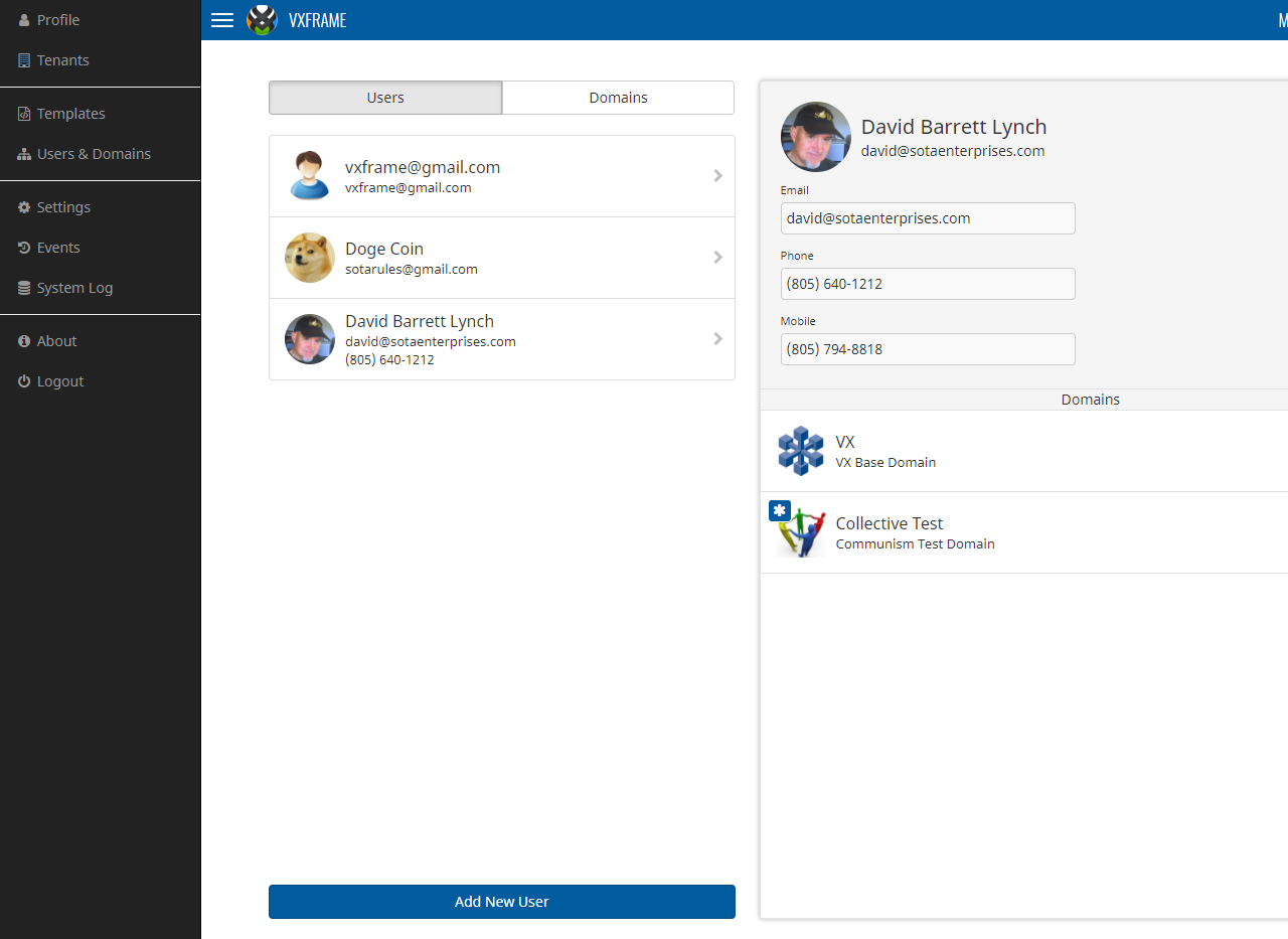
VXFrame comes with an off-canvas navigation bar which is normally hidden from view, but will fly in from the left side of the screen when the user touches or clicks the “burger” button on the top bar:

VXFrame uses off-canvas navigation instead of the standard Bootstrap menu bar, primarily to conserve screen real estate.
Entity Lists
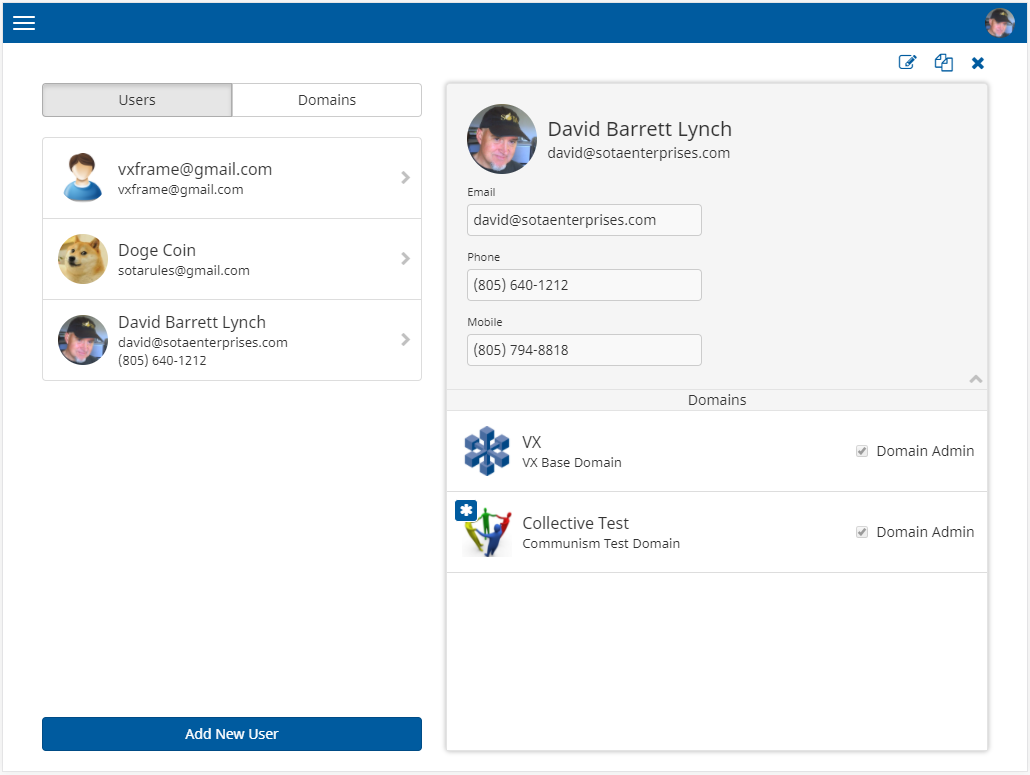
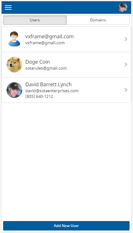
Modern applications display lists of data which can be touched, clicked, dragged and dropped. Each item in the list typically has an icon or picture on the left side, with explanatory lines of text on the right side. Example:

In VXFrame, entity lists are represented by component EntityList. An EntityList component can any number EntityItem components, each of which contains:
- An image
- A heading (shown larger)
- Up to two optional subheadings
- Optional chevrons for slide panels
- Optional image decoration
Developers can “wrap” EntityList components to create specialize, reusable lists, effectively inheriting EntityList functions and behaviors. For example, the list of users shown above is represented by UserEntityList, a specialized EntityList component.
EntityList and EntityItem components are highly parameterized, allowing wrapper components to specify basic appearance, images, titles, decorations and tooltips. A variety of event handlers can be registered with EntityList and EntityItem to handle gestures such as selection and drag/drop processing.
Entity Panels
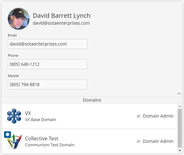
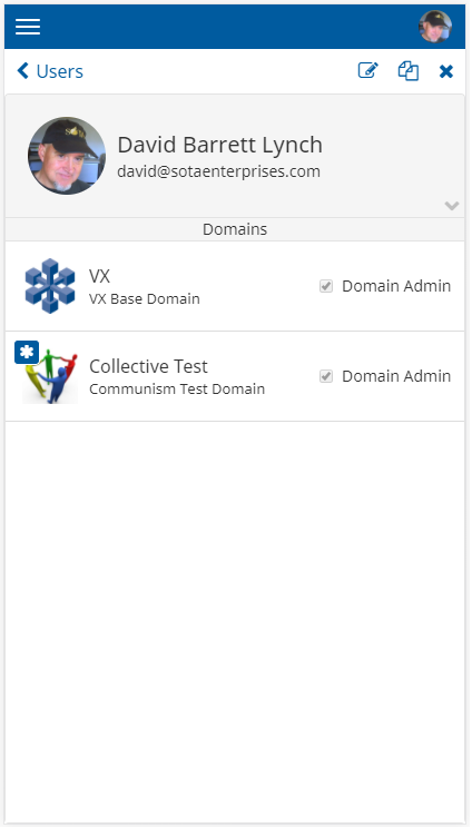
Entity panels are used to display and potentially edit information. Typically, an entity panel will display the information contained in a single database record, but it may also combine information from several related records. Example:

VXFrame allows you to develop entity panels by combining reusable subcomponents. For example, the entity panel shown above is represented by component UserDomainViewRight, which is comprised of the following subcomponents:
- RightPanel – Outer component which dynamically fills available screen space. By default the panel appears “raised” because of drop shadow drawn around the perimeter.
- RightHeader – A collapsible header which has a large image, a heading and up to two subheadings. Typically, RightHeader will contain a VXForm that contains fields of information of an entity.
- EntityListHeader – A thin title that is a heading for an entity list within the panel. In the example the thin rectangle bearing the word Domains is declared as an EntityListHeader component.
- DomainEntityList – The list of domains is a standard EntityList driven by the list of domains to which the user belongs. The DomainEntityList will automatically fill available space and will be scrollable by default.
Entity panels allow the developer to quickly snap together reusable subcomponents like Lego blocks to form panels which can be used for display or edit purposes.
Slide Pairs
Modern web applications use sliding animations, typically triggered by user gestures, such as swiping left or right. VXFrame makes it easy to develop subsystems that boast smooth, hardware-assisted sliding animations.
Three VXFrame components work together to deliver sliding behaviors:
- SlidePairContainer
- SlidePair
- SlidePanel
These components have been carefully designed to work together seamlessly to deliver an optimal experience on any desktop system or hand-held device.
On desktop systems, these three components create a side-by-side display, where the left-hand side presents a list of entities, and the right hand side presents the details of the currently-selected entity:

The utility of SlidePair is evident on a smaller screen such as a phone; in this case, SlidePair will display only the left-side panel:

When the user touches any of the users in the list, the SlidePair will trigger a right-to-left slide animation to bring the user detail panel into view:

The user can then perform various functions on the detail panel, such as editing, cloning or deleting the user record.
If the user presses the back button (< Users), SlidePair will trigger a left-to-right animation to return to the user list panel. SlidePair maintains a return stack so that sliding behaviors can be nested to any number of levels.
To use SlidePair, the developer must create left-side and right-side components. SlidePair subcomponents follow well-defined patterns, invoking pre-written methods in key event listeners. Typical animation behaviors can be achieved without custom programming.
SlidePair alleviates much of the drudgery normally needed to implement responsive applications. Developers are free to develop and refine their left-side and right-side components without having to deal directly with complex animation mechanics.
Core Subsystems
VXFrame comes with core subsystems that are essential for most multi-tenant SaaS applications. Subsystems may be used as-is or extended as needed.
| Subsystem |
Description |
| Signin |
Provides a sign-in landing page bearing system logo and name, plus entry fields for username and password. Provides hyperlink to recover lost passwords. |
| Profile |
Allows users to update their user profiles, including basic profile data, locale, language preference, timezone, name/address, phone numbers, photo image upload, password reset functions, notification settings, preferences and scheduled reports. |
| Tenants |
Allows users to edit basic tenant-level information, such as an icon that represents the tenant. Also allows general users to navigate to their tenants and domains and to select a domain to Make Current (i.e., switch into domain). |
| Users & Domains |
Manages users and domains, including functions for creating new users, creating new domains and managing the relationships between users and domains via drag/drop. Includes multi-tenant security model that permits users to have different privileges (roles) with respect to different domains. Includes administrative functions for enrolling new users and resetting passwords. |
| System Settings |
Administrative subsystem available to authorized users that permits updates to system, tenant and domain settings, including credentials for external systems such as Mailgun and Twilio. |
| Templates |
Generalized subsystem for creating, updating and retiring email templates, and components for setting emails to users, including mail-merge-style functions for performing variable substitutions. System includes support for sending HTML emails using templates. |
| Events |
Generalized subsystem for displaying system events, typically available to super administrators only. |
| System Log |
Generalized subsystem that consolidates client-side and server-side messages into a single display of rolling messages, typically available to super administrators only. |
Cost
Does React make sense from a strictly cost/benefits perspective? The short answer is “it depends” so let’s take it one case at a time.
When developing a new multi-tenant SaaS application from scratch, I’m sold on the cost effectiveness of React, both for up-front development and ongoing maintenance. The only drawback is the steep learning curve, but this can be mitigated by leveraging a reusable framework.
When developing from scratch without a reusable framework, React makes sense for larger systems that are subject to frequent coding changes by a team of developers, particularly mission-critical systems where UI bugs have severe consequences. In such cases, React coding is economically feasible, because the up-front costs to create reusable components can be offset by lower maintenance costs in the future.
When converting an existing system from Blaze to React, if your goal is to completely componentize the front end, you will likely reduce cost by leveraging a reusable framework. Instead of reinventing the wheel, you can can give your application a front-end makeover while preserving your back-end business logic.
Please be aware that adding React to your technology stack will be only the first step in a long process. React “conversion” can mean practically anything, from cursory experimentation with a few reusable components to a total replacement of the UI, culminating with the removal of Blaze from the system.
One way to measure the success of a Blaze-to-React conversion effort is to quantify the percentage of the document object model (DOM) that is controlled by React after conversion. In an ideal React application, the DOM will be completely controlled by React, and jQuery direct modifications of the DOM are considered an anti-pattern. React’s purpose is to facilitate a simplified, component-based programming experience that insulates the developer from the complexities of HTML, the DOM and jQuery. Code that bypasses the React component abstraction goes against this ideal and may increase maintenance costs and the probability of defects. However, even in an ideal project, parts of an application may never be componentized, particularly third-party packages that are not yet React-ready. Attempting to achieve 100% componentization can be costly and will usually reach a point of diminishing returns.
Note that component granularity alone is no panacea. A developer in a rush to finish converting a subsystem might create myriad granular components that have no chance of being reused. Creating truly reusable components requires more effort and than narrowly satisfying the immediate requirements at hand.
One helpful technique to engender reuse is to routinely test components outside of the system for which they were originally developed. This extra testing increases cost but ensures that the components are truly reusable.
Perhaps the most important key to a successful Blaze-to-React conversion is to accept that the process will require more time and effort than one would hope. You should strive to:
- Convert the existing application from Blaze to React in a non-disruptive way
- Capture a set of reusable components that can reduce costs of future efforts
The secondary goal of capturing reusable components can help justify conversion costs, because those components will reduce the costs of future projects.

