
Reign of the Front End
Since my last post in January 2014, I have thrown myself head-first into the world of JavaScript, Meteor, Node.js and MongoDB, working on two major (i.e., paid) projects plus one unpaid project.
The first paid project is a system to support sales functions of an established firm in the nutritional supplements space. The system is essentially an add-on to an existing CRM system. It uses the APIs to discover incomplete orders in the CRM system, then issues reminder emails to the prospects, and provides a convenient single-click method of completing those orders.
The second paid project is a multitenant SaaS in the eLearning space. The goal is to create a minimum viable product (MVP) to serve as a beta, and potentially to attract seed capital. This eLearning project has consumed most of my attention this year, and the challenges I have encountered are the impetus for this post.
In an earlier post, I suggested that Node.js and Meteor might yield an important indirect benefit: since JavaScript, a single language, is used for both client and server, JavaScript developers need not be pigeon-holed as back-end or front-end developers. Because the Meteor framework reduces friction on the back end, more intellectual horsepower might be freed up for the front end.
This could not come a moment too soon. Increasingly, modern websites are dynamic, responsive and reactive. They behave like installed apps. They push the limits of HTML5 and CSS3 leveraging complex stacks of JavaScript code to deliver the best possible user experience. They use animations, drag/drop, collapsible sections, momentum scrolling, popovers, type-ahead boxes, layer sliders, image galleries, maps, video feeds and graphs. Modern systems are expected to work equally well on touch devices and desktops, across all browsers.
We have little choice but to allocate more engineering bandwidth to the UI. Applications that look like they were designed before the tablet revolution will go the way of the dodo bird.
Nine Months
In the nine months since my last post, I’ve been immersed in the front end. I have come to see myself as a curator, scanning the globe for best-of-breed open-source offerings to facilitate our ambitious UX. Our front-end stack currently includes:
- Bootstrap 3-LESS
- Bootstrap Context Menus
- Bootstrap DateTime Picker
- Bootstrap Switches
- Bootstrap Tags Input
- Jasny Bootstrap Extensions
- Holder.js
- jQuery Sortable
- jQuery Touch Punch
- Selectize
- Amplify
- Touchspin
- Nearest
Evaluating open-source offerings can be time consuming. Bootstrap and jQuery add-ons tend to be in a constant state of flux as developers struggle to maintain compatibility with other systems, while simultaneously dealing with bugs and feature backlogs.
There are competing offerings, each with strengths and weaknesses. It can be helpful to first research what other developers are saying about the tools, and to take into account the sizes of their user bases.
It is necessary to install the tools and use them first-hand to prove that they will work harmoniously with the rest of the stack. You need to dive into the JavaScript code, frequently single-stepping through it with a debugger to diagnose issues. This process can disqualify a tool, resulting in a new round of searching and evaluation.
Be forewarned that choosing any tool will entail compromises: some features may work great but at the expense of others. You have to pick your poison.
Meteor Blaze
The Meteor Blaze release has been lauded as the solution for reconciling Meteor with jQuery. If you are not aware of the issue, it boils down to this: both Meteor and jQuery-based offerings want to control the document object model (DOM). When conflicts occur, you must intercede. Earlier versions of Meteor had template directives to allow you to declare certain areas of your web page constant (i.e., off limits for Meteor’s reactive updates). This would allow you to use tools such as jQuery Sortable, albeit foregoing reactive updates for constant regions.
The Blaze release is widely believed to have reconciled Meteor with many jQuery-based tools, but it is only a first step. The Meteor development team deprecated the constant template directive, implying that Blaze has solved the problem completely. I can say with considerable authority that this is not true. I have spent hours reconciling the behaviors of tools such as jQuery Sortable and Jasny Bootstrap with Blaze. I have reported issues to the Meteor development team and they have graciously acknowledged them.
Notwithstanding, Blaze is an enormous improvement. But there is still work to do to make it truly seamless, and until then UI developers will face extra effort, in some cases patching jQuery tools to get them to work correctly with Meteor.
Touch-Friendly
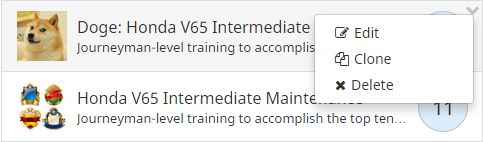
Desktop computers and touch devices have different event models. jQuery Touch Punch provides a means to convert touch events into traditional events so the same code can work on desktop and touch devices. But even when using Touch Punch, you have to be careful about the set of gestures your application supports. For example, there is no obvious gesture corresponding to right-mouse-click on a touch device, even though right-mouse-click is the standard event to display context menu or properties on desktop apps. This means that a modern web application will tend to avoid context menus, or at minimum provide a touchable icon (i.e., button) to display the menu, for example, a down-chevron, which seems to be all the rage these days:
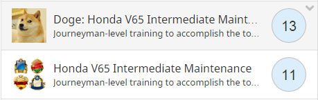
The down-chevron should not always be visible, but should appear only when the division that contains the menu is “hovered” over or touched. I refer to this as a hover control. This clutter-resisting design pattern has been made popular by Facebook.
There is no touch equivalent for double-clicking, so that gesture should be avoided entirely.
Other differences include the absence of movable dividers (sashes) in the touch world, and the fact that drag/drop gestures must be reconciled with scrolling: in the touch world the two gestures can be ambiguous unless explicit “handles” are designated for dragging.
Layout Challenges
A modern web site must work well on desktop and touch devices, and with all popular browsers at any screen resolution. Bootstrap is helpful for coping with differences in screen sizes, but it is no panacea. Media queries can help in limited cases by targeting CSS rules to particular devices, but complexity grows with each exception added; therefore, it is necessary to code your HTML and CSS carefully and test frequently to avoid changes that break the UI on one or more platforms.
Speaking with other UI developers, I’ve come to realize that we’re all in the same boat. We’re all looking at our iPads wondering why our text doesn’t properly center on certain devices, or why our scrolling area extends beyond the right margin of the containing division, or why when iOS momentum scrolling is enabled we cannot drag items out of the containing division without the item being rendered invisible. With each new problem, we will use Google to find hits that might give us more insight, or might yield a solution. Time and time again, we will eventually find the magic recipe of CSS and/or JavaScript to overcome the problem.
Consider this: the popular website JSFiddle is loaded with tens of thousands of hacks to beat the browser into submission. That such a web site is even necessary speaks volumes about the current frustrating state of affairs.
Occasionally, when I complain about this, some hot-shot UI developer will respond “we use LESS” as if LESS somehow ameliorates these issues. The implication is that the problems are attributable to the CSS language; unfortunately, the problem isn’t the syntax of CSS, it is how browsers interpret the rules, particularly in complex cases with heavily nested divisions and dealing with issues like dynamic resizing, justification, visibility, scrolling and truncation.
We use LESS for all of our projects, specifically the advanced configuration offered by package Bootstrap-LESS. But LESS doesn’t address the core issue: the difficulty of finding the magic set of rules that will yield the desired dynamic-resize behaviors. Your pages must behave beautifully on any desktop or mobile device, at any size.
CSS requires discipline and continuous refactoring. The never-ending battle to keep your CSS DRY (don’t repeat yourself) is thankless. Unless you pay careful attention to class naming conventions and rule granularity, your CSS can spin out of control. Seemingly innocent changes will begin to have unwelcome side-effects.
Lately, I’ve been adding detailed comments to my CSS. Whenever I code a complex set of rules to overcome some layout issue, I write comments as clearly as possible to explain the intent of those rules, particularly in cases where the intent is to circumvent a browser bug. When the CSS has to be changed, comments regarding the original intent can help minimize costs.
The Front End Remains the Same
Last year, I went on a quest to find the best full-stack framework to develop modern web applications. I evaluated Ruby on Rails, Grails, ASP.NET and Meteor/Node.js. I imagined that I would find the best framework, try to learn it inside-out, and then use it to develop exciting applications.
But there was one thing that I didn’t fully appreciate: regardless of which framework you choose, the front-end issues will always be there. JavaScript, HTML5, CSS3 and all of the related challenges will be virtually identical. You’re going to have to worry about responsive design, layout, advanced behaviors touch devices and browser compatibility.
If you are a full-stack developer, you’ll spend the majority of your time in the front-end world of JavaScript and jQuery, regardless of whether your back end may be PHP, Django, Rails, JSP, ASP.NET or Node.js.
In my view, this reinforces the notion that Node.js (and particularly Meteor) is a great choice for new systems. Since there is no viable way to avoid JavaScript on the front end, why not go all the way and use it for everything?
When Will Our MVP Be Ready?
Notwithstanding great tools, project durations can be difficult to estimate, because no one can anticipate the snags that will arise. One thing is predictable: a given project will take longer than one would wish. A modern web site that works beautifully on all devices and has cutting-edge behaviors will be expensive.
Today, one factor seems irreducible: the cost of research. When you embark on creating a new subsystem that requires advanced behaviors, you’ll be forced into research mode to evaluate open-source offerings or custom coding. When you run into a snag, such as unacceptable behavior on some device, you will have choices (1) ignore the issue (2) consult with a knowledgeable colleague (3) fight harder by Googling, looking at the source code and experimenting.
In research mode, it is difficult to estimate how long it might take to find a solution. To estimate the cost, you must rely on your instincts, comparing each new challenge to similar challenges in the past. Sometimes you get lucky, but more often you don’t.
There will be plenty of dead ends, because no one can make the right choices every single time. New JavaScript offerings, platforms and services are constantly being introduced, and competitive pressures will compel you to learn about them and incorporate them into your applications.
Today, it may be drag and drop. Tomorrow it may be streaming video. The next day you may be working with 3D graphics in WebGL. You’ll have to learn many APIs, and use them defensively with robust error control and graceful degradation. Your system is not an island but an amalgamation of services, each of which is another potential point of failure.
We are all constantly learning. What we don’t know today, we will learn tomorrow. We must look at new challenges with a sense of wonder, with the eyes of a child. We must take the time to help and support one another, to share what we have learned.